


Barclays
Improving a payment app
We relaunched Barclays’ P2P payments app, using design to resolve negative perceptions of the initial release.
Our solution streamlined application, established a clearer purpose and won awards for the application of visual identity.

The challenge
Barclays’ P2P app had very low user numbers (almost exclusively existing Barclays customers, despite being open to everyone) due to inconsistent sign-up processes and confusing core journeys.
Our goal was to identify key pain points and redesign the core journeys applying the new brand, and appeal to non-Barclays customers.
My responsibilities
- Led design and prototyping across the app and website
- Supported and moderated user testing
- Collaborated with in-house design team to develop new features
- Supported creation of new brand direction
The team
Working as a consultant for the Barclays app team, I worked with brand designers and the in-house product design and owner teams.
The process
1/4
Identifying the core problems
I conducted an app audit, analysed user feedback and usage data, and held stakeholder interviews. With this I then mapped user types against existing journeys, identifying key pain points and opportunities to improve.
Key findings
- Sign-up process favoured Barclays customers, reinforcing exclusivity
- Common tasks felt unnecessarily complex, undermining user confidence
- Users frequently directed to call for support instead of in-app assistance
- Prospective users were unclear on what the app offered
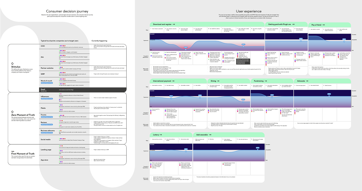
Customer journey map showing how our personas found and used the app and where key issues arise
2/4
Focusing on pain points
After mapping the journeys, I began to establish a new app IA, focusing on dedicated spaces for key journeys with clear flows between functionality.
I then translated this structure into flows and lo-fi wires.
My initial experiments confirmed an optimal three-action framework: send, receive, and spend, creating defined spaces for clearer journeys.
The inclusion of shopping required clear distinction from money movement features to maintain user trust in the app.
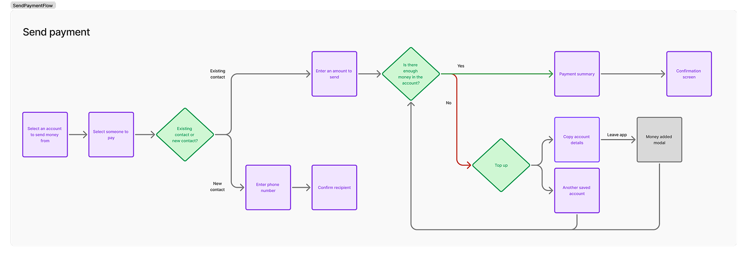
I mapped out core user journey flows and identified areas to streamline
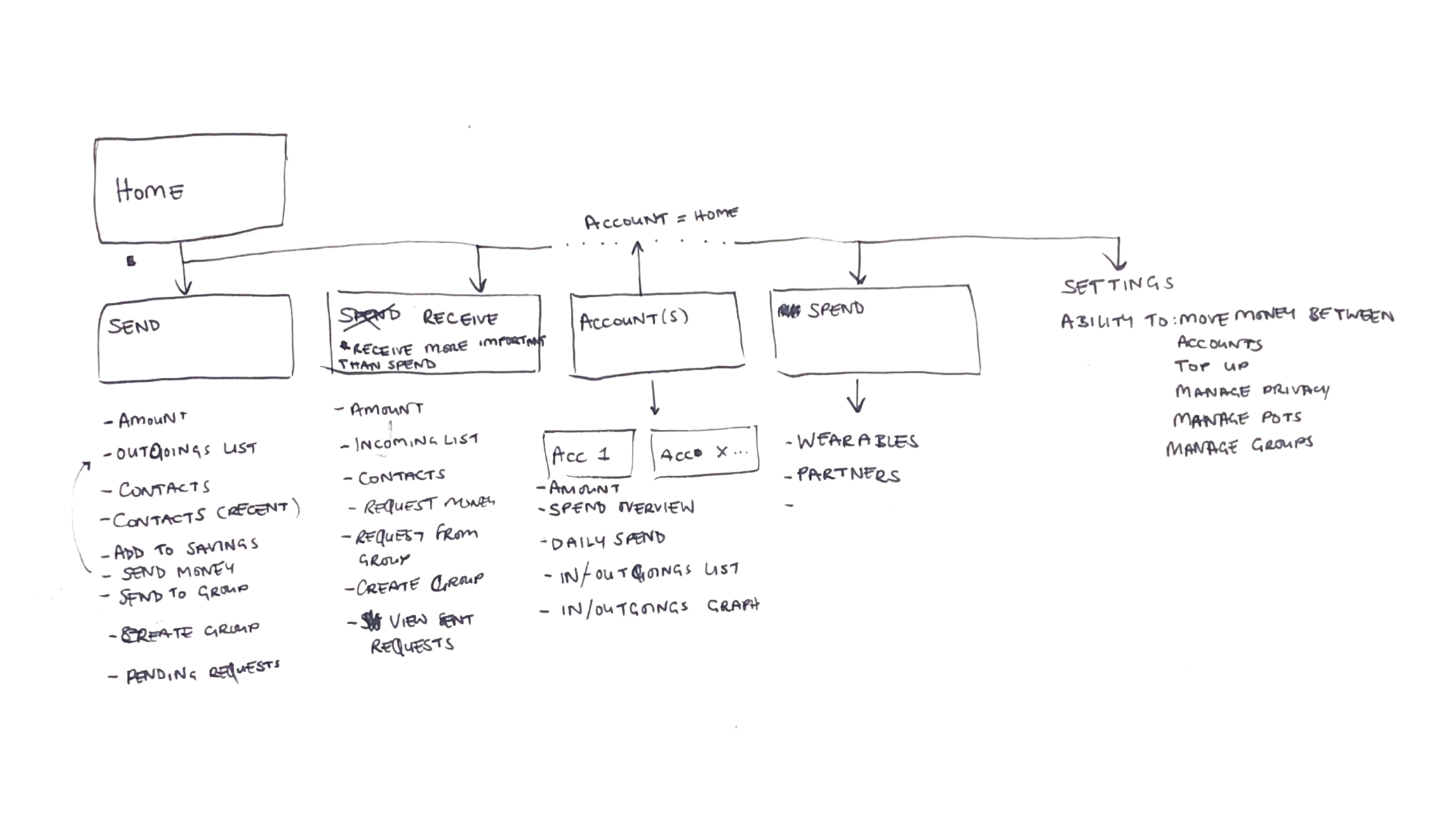
I sketched out initial IA before being formalised
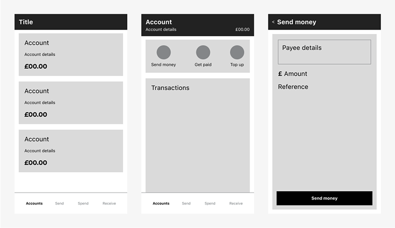
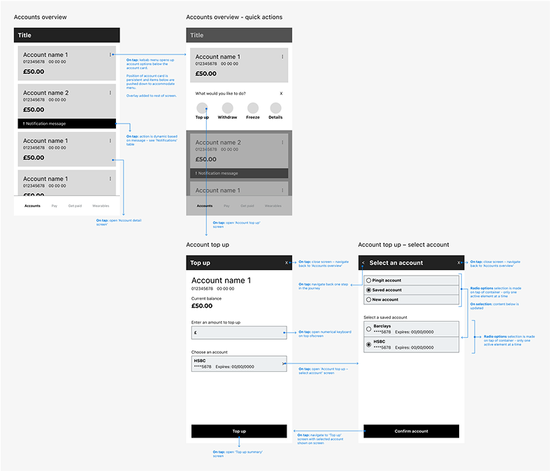
I used lo-fi wireframes to add detail to user flows, avoiding any visual design decisions
3/4
Adding definition
Continuing to add detail to the wireframes, I wanted to reflect the new brand line 'Move money at the speed of life' in the experience. This was achieved through concise journeys, clear navigation, and seamless transitions, applying contextual controls that would support the user throughout the app.
Working with brand designers, I began taking brand expressions and applying them to the app. Through this process I looked to include the brand in meaningful interactions, beyond just application of colour and typefaces.
I added detail to wireframes and outlined expected interactions
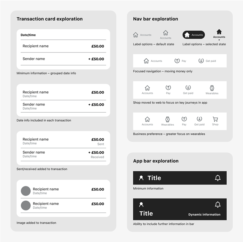
My exploration into how components could be displayed in wireframes
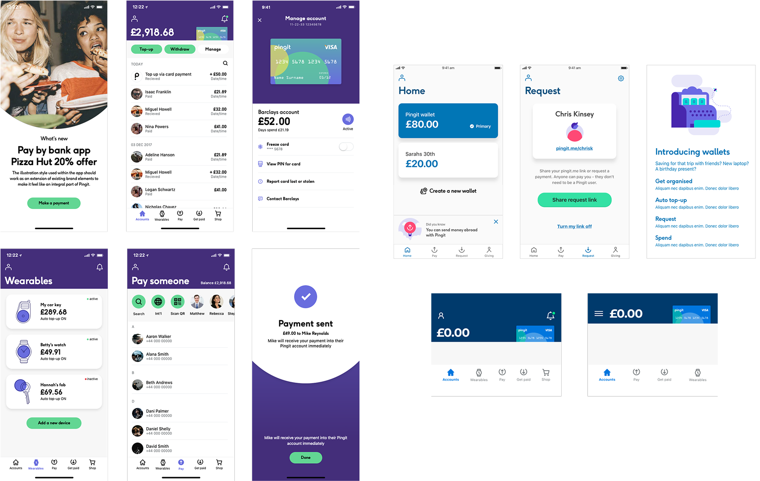
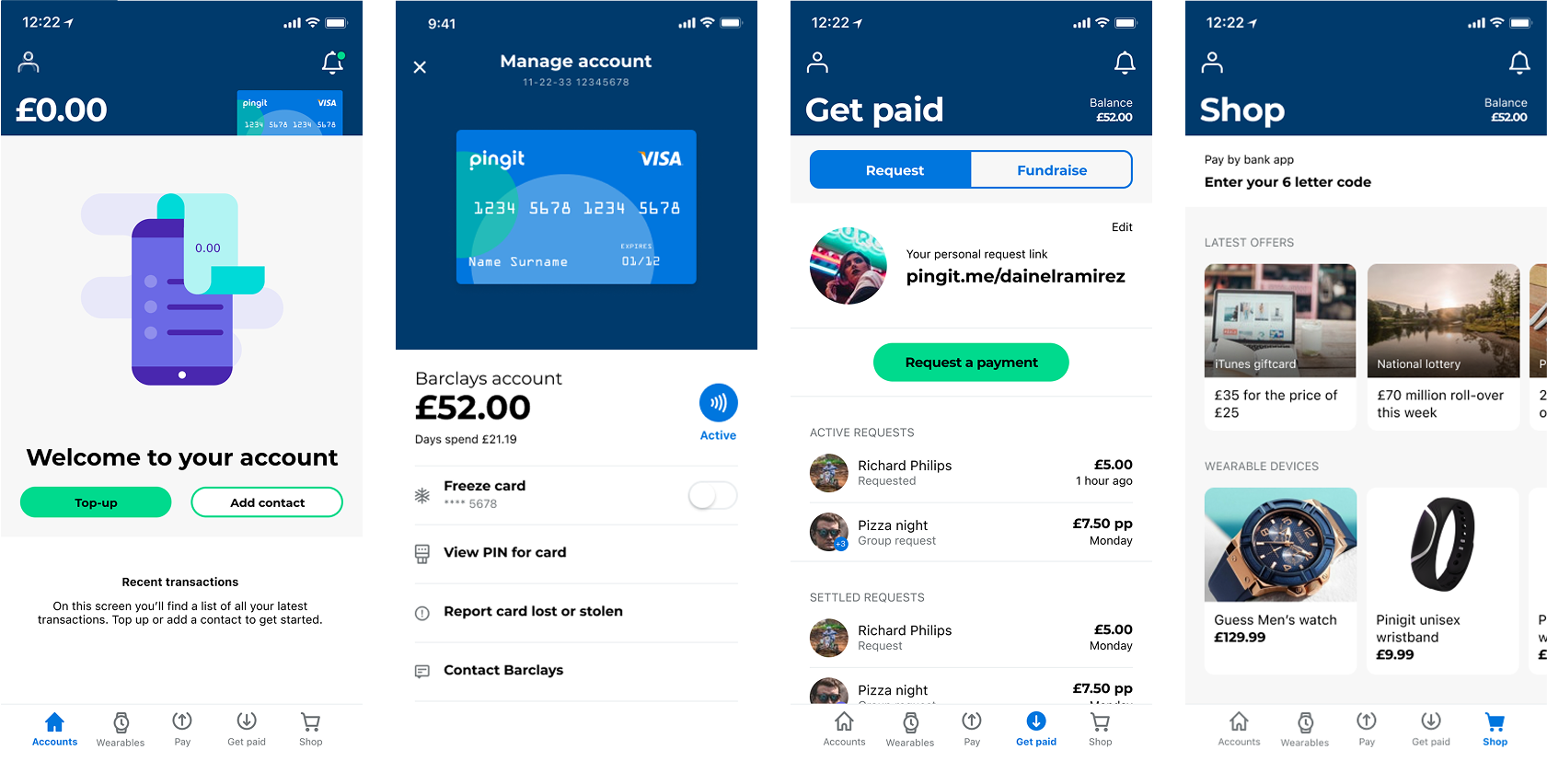
We explored application of design direction in branded elements and transitions
4/4
Testing
Once we had a concept that we felt answered the core issues, we validated core journeys and brand direction through user testing.
Key findings
- Simpler navigation consistently outperformed complex alternatives
- Additional menu items like 'shopping' and 'wearables' confused and undermined payments credibility
- Barclays association improved integrity while a separate identity was preferred by non-Barclays users
I created prototypes for key journeys, taking a detailed look at navigation elements and brand expression
The outcome
Open to all
Our redesign transformed perception from Barclays-exclusive to openly accessible, while maintaining trust through a clarity of connection to Barclays.
A clear purpose
We established sending and receiving money as primary uses of the app. Simplified journeys reinforced core values from initial use.
A consistent experience
We created consistency within the app and across external touchpoints, ensuring a seamless journey from awareness through to active engagement.
Next up
Let’s connect ashleydanieldsouza@gmail.com
Case studies
Barclays
Improving a payment app
We relaunched Barclays’ P2P payments app, using design to resolve negative perceptions of the initial release.
Our solution streamlined application, established a clearer purpose and won awards for the application of visual identity.
The challenge
Barclays’ P2P app had very low user numbers (almost exclusively existing Barclays customers, despite being open to everyone) due to inconsistent sign-up processes and confusing core journeys.
Our goal was to identify key pain points and redesign the core journeys applying the new brand, and appeal to non-Barclays customers.
My responsibilities
- Led design and prototyping across the app and website
- Supported and moderated user testing
- Collaborated with in-house design team to develop new features
- Supported creation of new brand direction
The team
Working as a consultant for the Barclays app team, I worked with brand designers and the in-house product design and owner teams.
The process
1/4
Identifying the core problems
I conducted an app audit, analysed user feedback and usage data, and held stakeholder interviews. With this I then mapped user types against existing journeys, identifying key pain points and opportunities to improve.
Key findings
- Sign-up process favoured Barclays customers, reinforcing exclusivity
- Common tasks felt unnecessarily complex, undermining user confidence
- Users frequently directed to call for support instead of in-app assistance
- Prospective users were unclear on what the app offered
Customer journey map showing how our personas found and used the app and where key issues arise
2/4
Focusing on pain points
After mapping the journeys, I began to establish a new app IA, focusing on dedicated spaces for key journeys with clear flows between functionality.
I then translated this structure into flows and lo-fi wires.
My initial experiments confirmed an optimal three-action framework: send, receive, and spend, creating defined spaces for clearer journeys.
The inclusion of shopping required clear distinction from money movement features to maintain user trust in the app.
I mapped out core user journey flows and identified areas to streamline
I sketched out initial IA before being formalised
I used lo-fi wireframes to add detail to user flows, avoiding any visual design decisions
3/4
Adding definition
Continuing to add detail to the wireframes, I wanted to reflect the new brand line 'Move money at the speed of life' in the experience. This was achieved through concise journeys, clear navigation, and seamless transitions, applying contextual controls that would support the user throughout the app.
Working with brand designers, I began taking brand expressions and applying them to the app. Through this process I looked to include the brand in meaningful interactions, beyond just application of colour and typefaces.
I added detail to wireframes and outlined expected interactions
My exploration into how components could be displayed in wireframes
We explored application of design direction in branded elements and transitions
4/4
Testing
Once we had a concept that we felt answered the core issues, we validated core journeys and brand direction through user testing.
Key findings
- Simpler navigation consistently outperformed complex alternatives
- Additional menu items like 'shopping' and 'wearables' confused and undermined payments credibility
- Barclays association improved integrity while a separate identity was preferred by non-Barclays users
I created prototypes for key journeys, taking a detailed look at navigation elements and brand expression
The outcome
Open to all
Our redesign transformed perception from Barclays-exclusive to openly accessible, while maintaining trust through a clarity of connection to Barclays.
A clear purpose
We established sending and receiving money as primary uses of the app. Simplified journeys reinforced core values from initial use.
A consistent experience
We created consistency within the app and across external touchpoints, ensuring a seamless journey from awareness through to active engagement.
Next up
Let’s connect ashleydanieldsouza@gmail.com